 This week’s #WednesdayWrite should be fun and easy for everyone. You probably remember yearbook or senior superlatives from your days in high school. In case you didn’t go to high school in the US, let me explain with some examples.
The word superlative means “the highest degree” or “the highest quality.” Grammatically, there are three degrees of comparison: positive, comparative, and superlative. Some examples should remind you how they work:
| Positive |
Comparative |
Superlative |
| good |
better |
best |
| warm |
warmer |
warmest |
| likely |
more likely |
most likely |
| fast |
faster |
fastest |
For yearbook or senior superlatives, the class usually votes on which students fit into specific categories, such as Most Likely to Succeed, Best Dressed, and Smartest.
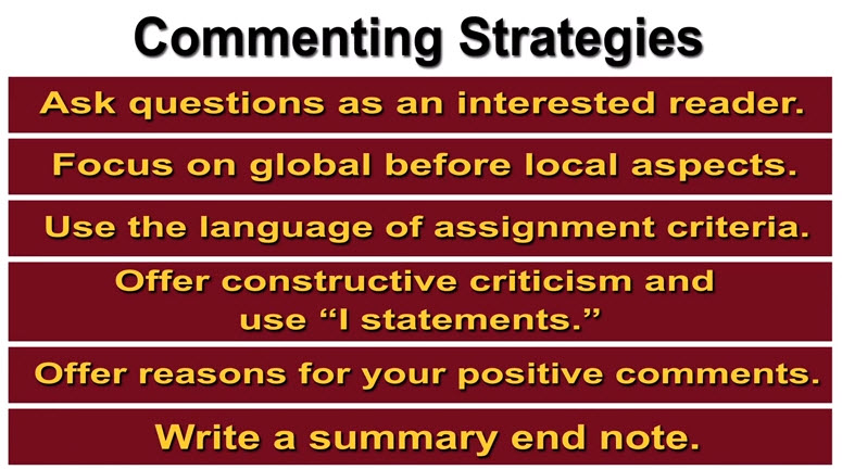
In this activity, you will focus on the kinds of writing in your field, which you should have gathered in your Analysis project draft. Copy the list below and paste it into your comment. Add your answers for the items. After you post your answers, read what others have posted and reply, if you like. Note there’s no right or wrong answer here. You’re just sharing your opinion, based on the evidence you have so far.
- Your intended career field
- Longest kind of document someone in your field writes
- Shortest kind of document someone in your field writes
- Most frequent kind of document someone in your field writes
- Most important kind of document someone in your field writes (and why)
- Most difficult/challenging kind of writing in your field (and why)
- Easiest kind of writing in your field (and why)
- Biggest surprise about writing in your field
- Favorite thing about writing in your field
- Hokiest thing you have done (that you can talk about in class)
One final note: The remaining major projects focus on kinds of writing in your field, so this activity should help you decide which kind(s) of writing to work on for the rest of the course.
Photo credit: Stack of papers by Phillip Wong on Flickr, used under a CC-BY 2.0 license.
Last updated on Wednesday, October 4, 2017
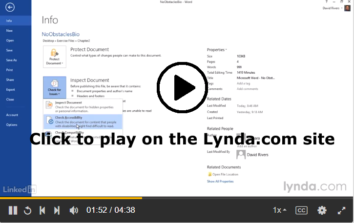
 We all rely on grammar and style checkers to help us find the small errors in our writing. Anyone who has had autocorrect go wrong, however, knows that grammar and spell checkers are not necessarily accurate. Sometimes (as in the case of the unicorn-riding police officer) these tools can change our messages to say things we never intended.
 Friday, October 6 is the last date to drop classes and to change from A-F to P/F, so I wanted to remind everyone how grades work for the course.
  Last week, I shared design tips that you can use to improve your Analysis table. This week, I am going to share several posts that address proofreading and formatting changes that will make your project even better.
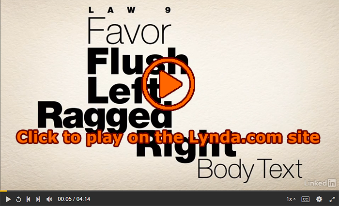
 This week, I have been sharing information to help you polish the content and design of
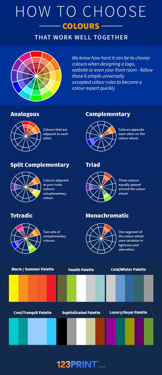
 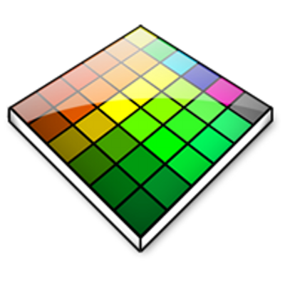 Often you see images on a website or photo that you like, but you may not know how to get the exact RGB or Hex codes to use them. You can use a color picker app to identify colors on your screen.