 At some point, you are going to face a challenge that threatens your progress on a project in the workplace. No matter how hard you work, it’s bound to happen. Sometimes it’s your fault. Sometimes someone else is to blame. Regardless of who is responsible, the important question is how you will respond. You have to decide what you can do that will preserve your (or the company’s) reputation while still satisfying the needs and requirements of your client.
That is where today’s #FridayFact comes in: The best strategy is to let people know of problems immediately. I don’t mean call the stakeholders in a panic, of course. Meet with your team or your manager, and figure out how to handle the situation.
As soon as you have a plan, let your stakeholders know. Tell them what happened, why it happened (if pertinent), and what you are going to do. Don’t blame anyone. That doesn’t help. Focus on how you will do your best to get the project in as close to the deadline as possible.
Sometimes you need your stakeholders to help with the solution. Perhaps they will need to approve a new supply or a different design. In those cases, you meet with your team to figure out the alternatives and their strengths and weaknesses. Once you have the options figured out, contact the stakeholders with the information, giving them a recommendation for the best choice.
In addition to my suggestions, check out The Muse’s suggestions for What to Do When You Know You’re Going to Miss a Deadline.
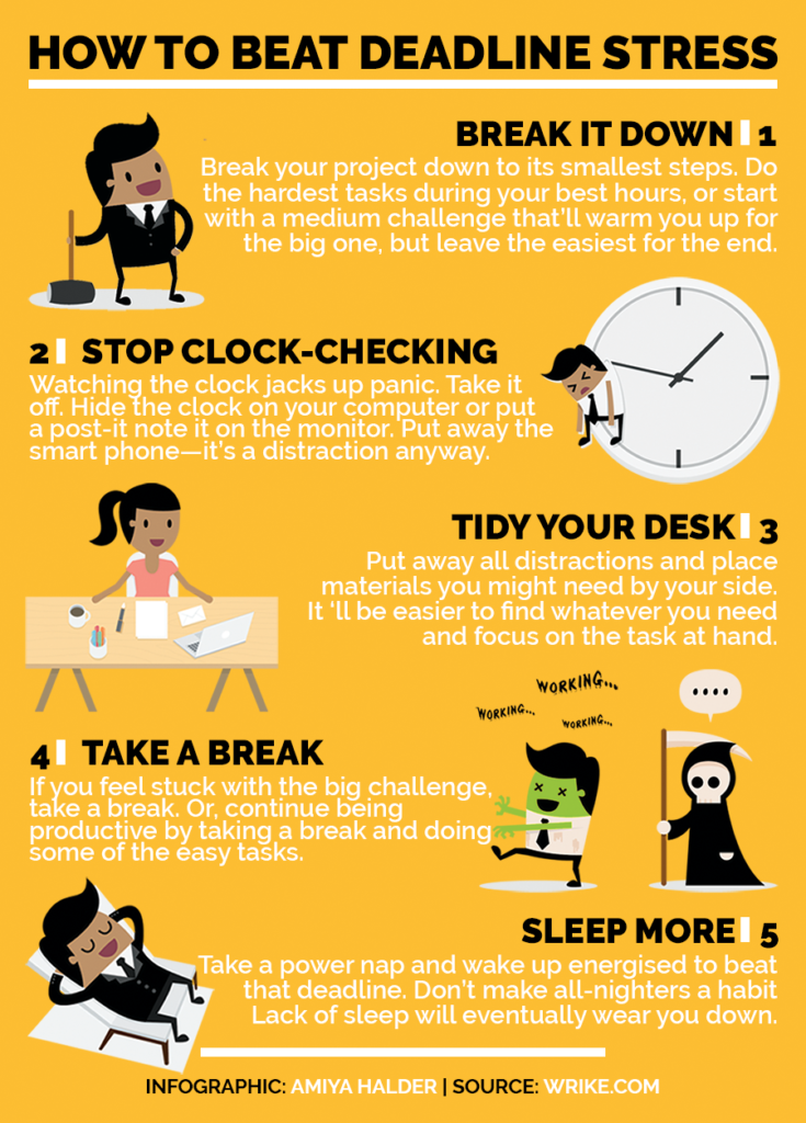
P.S. Anyone other than me bugged by the gender representation in that infographic? Notice that it’s all men, except for the suggestion that deals with cleaning. Grr.
Note: This infographic needs a text-based transcript. See the Optional Accessibility Transcript Activity for more details.
Last updated on Sunday, November 5, 2017


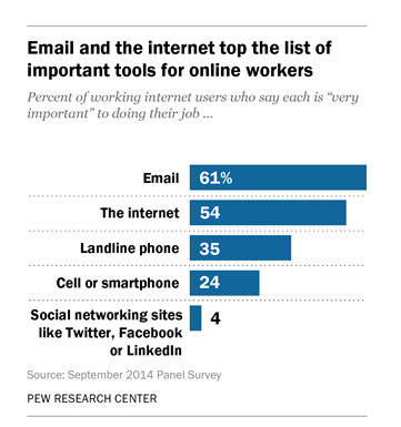 Email is critical to the work of over half of the workers surveyed by the Pew Research Center on
 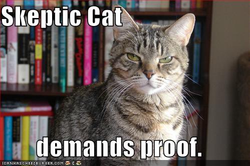 To avoid being accused of spreading untrue information, be a fact checker. When you write a document in the workplace, your first task is to compose the document; but before you send that project out to your readers, you need to do some fact checking to verify the ideas.
 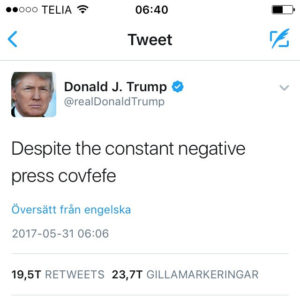 You already know that your job application materials should be error free. Misspell words,
  If you want a positive response to your proposal, be up front with the key information. Don’t keep your readers in suspense, waiting for the details.
 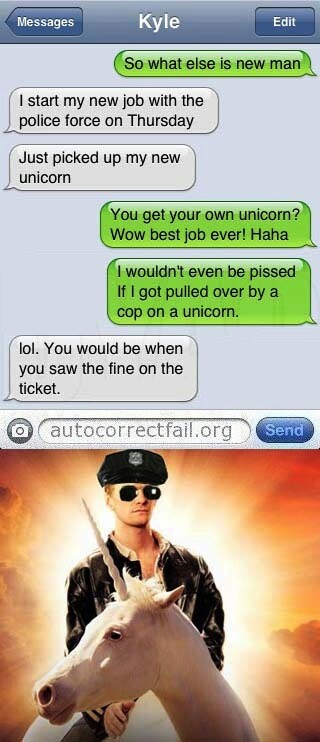 We all rely on grammar and style checkers to help us find the small errors in our writing. Anyone who has had autocorrect go wrong, however, knows that grammar and spell checkers are not necessarily accurate. Sometimes (as in the case of the unicorn-riding police officer) these tools can change our messages to say things we never intended.
 This week, I have been sharing information to help you polish the content and design of