Skip to content

#WeekendWatch: Control Page Breaks in Tables

#WeekendWatch: Control Page Breaks in Tables published on

As you are working on your table for the Analysis project, you may find yourself in the situation where a row of information breaks onto two pages. Our #WeekendWatch takes care of that problem. All you need to do is change a checkbox in Word to keep rows of information together.

This Auburn University Writing Center video demonstrates how to change that setting in Microsoft Word for Mac. The process for Windows is similar, so it’s still worth watching the video if you’re a Windows person.

If you use Windows, use the instructions from Microsoft to make the change.


Note: This video has closed captioning, so it does not need a transcript.


#FridayFact: Grammar and Style Checkers Are Often Wrong

#FridayFact: Grammar and Style Checkers Are Often Wrong published on

Screenshot of autocorrect on a phone, with the image of a police officer riding a unicornWe all rely on grammar and style checkers to help us find the small errors in our writing. Anyone who has had autocorrect go wrong, however, knows that grammar and spell checkers are not necessarily accurate. Sometimes (as in the case of the unicorn-riding police officer) these tools can change our messages to say things we never intended.
In the same way that you must double-check the changes that autocorrect suggests, you have to pay attention to the grammar and style tools that are available in your word processors. Read the Slate.com article Microsoft Word’s Grammar and Style Tools Will Make Your Writing Worse for lots of examples of how Word can suggest changes that will confuse your readers.

Finally, as long as you are still at Virginia Tech, remember that you have free access to the Lynda.com course Grammar Foundations (below). You can look up any grammar questions you have there.

Note: This video has closed captioning, so it does not need a transcript. The screenshot of autocorrect DOES need a text-based transcript however. See the Optional Accessibility Transcript Activity for more details.


#InfographicInspiration: Punctuation Rules

#InfographicInspiration: Punctuation Rules published on

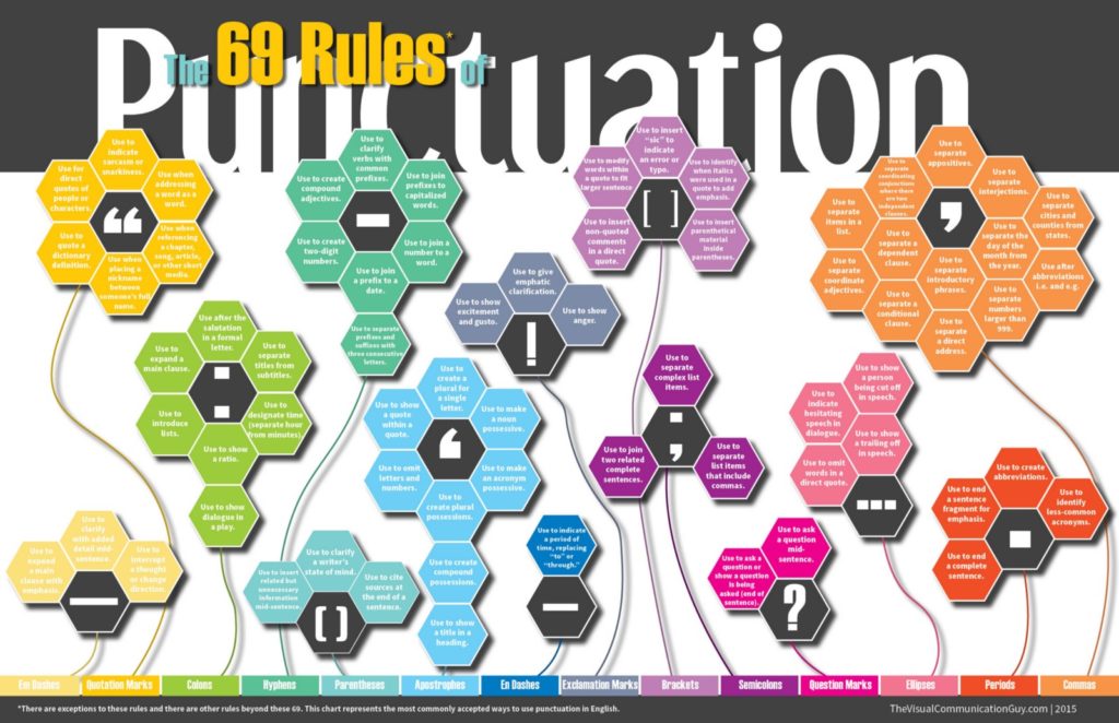
Lots of handbooks explain how punctuation works, but who wants to read pages of information in a grammar textbook? Today’s #InfographicInspiration won’t eliminate the need to look up how certain rules work; however, it does provide a nice overview of the primary ways that most punctuation marks are used.

I suspect that you will be familiar with a lot of the rules, especially for marks like periods, commas, and exclamation points. Other punctuation marks may be new to you, such as en dashes and em dashes.

If you find anything new to you or need more information on an exclamation, try searching for details on the information on Punctuation on the Purdue OWL site.


Note: This infographic needs a text-based transcript. See the Optional Accessibility Transcript Activity for more details.


#WednesdayWrite: Writing Superlatives

#WednesdayWrite: Writing Superlatives published on

This week’s #WednesdayWrite should be fun and easy for everyone. You probably remember yearbook or senior superlatives from your days in high school. In case you didn’t go to high school in the US, let me explain with some examples.
The word superlative means “the highest degree” or “the highest quality.” Grammatically, there are three degrees of comparison: positive, comparative, and superlative. Some examples should remind you how they work:

Positive Comparative Superlative
good better best
warm warmer warmest
likely more likely most likely
fast faster fastest

For yearbook or senior superlatives, the class usually votes on which students fit into specific categories, such as Most Likely to Succeed, Best Dressed, and Smartest.

In this activity, you will focus on the kinds of writing in your field, which you should have gathered in your Analysis project draft. Copy the list below and paste it into your comment. Add your answers for the items. After you post your answers, read what others have posted and reply, if you like. Note there’s no right or wrong answer here. You’re just sharing your opinion, based on the evidence you have so far.

  1. Your intended career field
  2. Longest kind of document someone in your field writes
  3. Shortest kind of document someone in your field writes
  4. Most frequent kind of document someone in your field writes
  5. Most important kind of document someone in your field writes (and why)
  6. Most difficult/challenging kind of writing in your field (and why)
  7. Easiest kind of writing in your field (and why)
  8. Biggest surprise about writing in your field
  9. Favorite thing about writing in your field
  10. Hokiest thing you have done (that you can talk about in class)

One final note: The remaining major projects focus on kinds of writing in your field, so this activity should help you decide which kind(s) of writing to work on for the rest of the course.


Photo credit: Stack of papers by Phillip Wong on Flickr, used under a CC-BY 2.0 license.


Reminder: Your Course Grade in Canvas

Reminder: Your Course Grade in Canvas published on

Friday, October 6 is the last date to drop classes and to change from A-F to P/F, so I wanted to remind everyone how grades work for the course.
Remember that grades are based on labor.

  • If you do the required work, you are guaranteed a B in the course.
  • If you do more than the basic requirements, you can earn a grade higher than a B.
  • If you do not do the required work, you will earn a grade lower than a B.

You can find complete details on the information how grades are tracked in Canvas, how completes and incompletes are indicated, and how to tell how you’re doing in the post How Canvas Grades Works from the first week of classes.


Photo credit: W F LaBar Report Card by Arthur T. LaBar on Flickr, used under Public Domain (CC0).


#TuesdayTutorial: Avoid Centered Text

#TuesdayTutorial: Avoid Centered Text published on

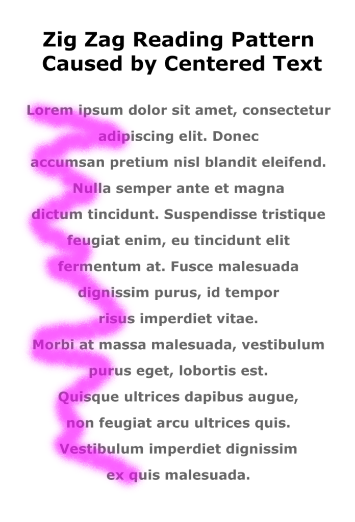
Zig Zag Reading Pattern Caused by Centered TextLast week, I shared design tips that you can use to improve your Analysis table. This week, I am going to share several posts that address proofreading and formatting changes that will make your project even better.
Reading Patterns and Centered Text

Today’s #TuesdayTutorial focuses on the alignment of the text in your document. Remember the #FridayFact in September that explained the F-shaped reading pattern? That idea comes into play with the tip to avoid centered text alignment in your documents.

When you center text, the left margin zig zags back and forth down the page, which makes it hard to read in the F-shaped pattern that people prefer.

Instead of skimming down the left margin to look for the highlights and headings, the eye has to search back and forth for the information on the page, as shown in the image on the right.

Learn More

Watch the following Lynda.com tutorial video, Favor flush-left, ragged-right body text (4m14s), for additional explanations and tips on this important guideline for the way that text is aligned on a page. Remember that Lynda.com videos are free to Virginia Tech students with your VT.EDU login. Start at the VT.EDU login page to access these resources.

Screenshot of the Lynda.com video Favor flush-left, ragged-right body text

Note: This video has closed captioning, so it does not need a transcript.


Peer Review & Submission of Analysis Project

Peer Review & Submission of Analysis Project published on

This is the post for the week of October 2, 2017.

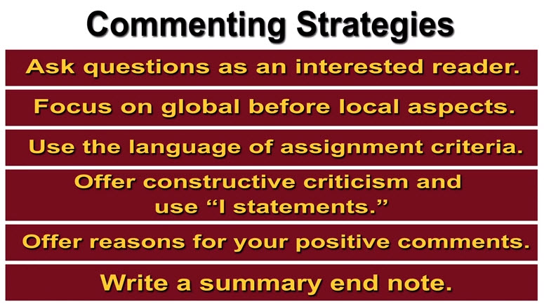
Screenshot from the Peer Review:Commenting Strategies video
Screenshot showing strategies from the Peer Review:Commenting Strategies video

This week, you will share a draft of your project with your writing group, give feedback to your writing group members, revise your project as needed, and then submit the project.

Readings for the Week

Tasks for the Week

  1. By 11:59PM on Monday, October 2, submit your 09/29 Labor Log in Canvas, if you are using the grace period.
  2. Review previous posts that can help you improve your Analysis project:
  3. Rewatch the Peer Review: Commenting Strategies video for specific ways to comment on one another’s drafts. I will check for references to these strategies in your group comments.
  4. By 11:59PM on Wednesday, October 4, post a draft of your project in the Group Feedback on Analysis of Writing Projects Discussion in Canvas.
  5. By 11:59PM on Friday, October 6, post feedback on the drafts posted by your group members in the Group Feedback Discussion in Canvas. Be sure to use the strategies from the Peer Review: Commenting Strategies video.
  6. By 11:59PM on Monday, October 9, submit your project in the Analysis assignment in Canvas. If you are using the grace period, submit your project by 11:59PM on October 12.
  7. By 11:59PM on Friday, October 6, write your 10/06 Labor Log in Canvas. Specific questions for your log are included in Canvas. The grace period for your log entry ends at 11:59 PM on Monday, October 2.


#WeekendWatch: Accessibility in Word

#WeekendWatch: Accessibility in Word published on

Lynda.com Login Help

Lynda.com videos are free to Virginia Tech students with your VT.EDU login. Start at the VT.EDU login page to access these resources.

Our #WeekendWatch shares one more way that you can improve your table for the Analysis project: Spend some time making your table accessible to people who use magnification or screen readers.

Here’s an example of why accessibility matters in a table. If a table is not set up properly, the screen reader will read the information as if the columns follow one another like sentences in a paragraph. The reader moves through the document from left to right and top to bottom. To make a table more accessible, you need to identify table headers. Once you do, the screen reader will read the column header and then the content of the cell.

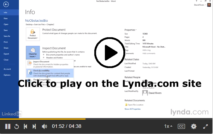
The Lynda.com video below demonstrates how the process of Using the Accessibility Checker, which is built into Microsoft Word. The simple tool will suggest ways that you can change your document to make it more accessible.

Screenshot of Lynda.com lesson on checking accessibility in Microsoft Word

You can learn more about accessibility in Word by watching all of Chapter 2: Creating Accessible Word Documents on Lynda.com. In addition to the Lynda.com videos, you can find more information in the resources linked below:


Note: This video has closed captioning, so it does not need a transcript.


#FridayFact: Tables Can Be Boring

#FridayFact: Tables Can Be Boring published on

Old French Table by French Finds on Flickr, used under a CC-BY licenseThis week, I have been sharing information to help you polish the content and design of your Analysis project. Today, I am continuing that theme with my #FridayFact: Tables can be boring. If you do not work on document design, tables are often a visual jumble of words and numbers. Same goes for spreadsheets, but we won’t talk about them in this course.

Back to tables, with so much information jammed into columns and rows, the information can become hard to read. If it’s hard to differentiate between the rows of information, readers can easily lose track of where they are in a table. When the column headings scroll out of view, readers may not recall the information every column contains.

To help you solve the challenge of boring tables, I have these articles you can read and apply to your Analysis project:

There are a lot of ads on these pages. I use a browser extension that hides all the ads. I never see them at all. If the ads bother you, you might try one of the blockers too. I’m using Adblock in the Chrome browser.


Photo credit: Old French Table by French Finds on Flickr, used under a CC-BY license.


#InfographicInspiration: Choosing Colors

#InfographicInspiration: Choosing Colors published on

Using a Color Picker

Color Cop IconOften you see images on a website or photo that you like, but you may not know how to get the exact RGB or Hex codes to use them. You can use a color picker app to identify colors on your screen.
I use Color Cop on Windows and the Coolors Generator in my browser. You can find other options (free and paid) for Mac and Windows by googling for "color picker."

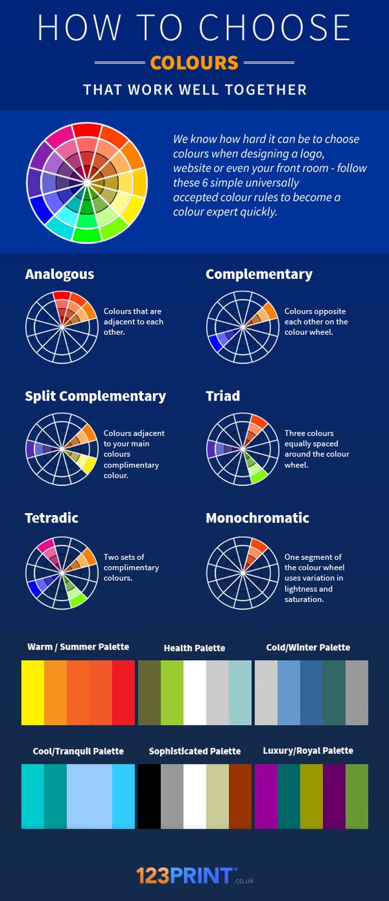
Today’s #InfographicInspiration focuses on colors. When working with tables, you can use shading and borders as part of your document design. Chosen well, colors can greatly improve a project, making the information more readable by creating contrast and highlighting important details. Chosen poorly however, colors can make a project harder to read because they lack contrast or distract from the information.

Think about how you use a highlighter in your notes or a printed book. If you highlight an entire page, essentially nothing is highlighted. Nothing can stand out. You have to have contrast between highlighted words and the rest of the page. Likewise, if your highlighter is drying out, it can leave very faint marks on the page. Again, there isn’t enough contrast between the elements on the page.

To make the most of your color choices, consider the ideas in today’s infographic. Any one of the ways of linking colors can make a nice contrast (e.g., choosing complementary or triadic colors). At the bottom of the infographic, you’ll find color palettes of combinations that work well. Do note that the infographic is British, so it uses British spelling.

How to Choose Colours That Work Well Together


Note: This infographic needs a text-based transcript. Because this image discusses colors, the transcript needs to identify and/or describe the colors. See the Optional Accessibility Transcript Activity for more details.


Primary Sidebar