Skip to content

#WeekendWatch: Accessibility in Word

#WeekendWatch: Accessibility in Word published on

Lynda.com Login Help

Lynda.com videos are free to Virginia Tech students with your VT.EDU login. Start at the VT.EDU login page to access these resources.

Our #WeekendWatch shares one more way that you can improve your table for the Analysis project: Spend some time making your table accessible to people who use magnification or screen readers.

Here’s an example of why accessibility matters in a table. If a table is not set up properly, the screen reader will read the information as if the columns follow one another like sentences in a paragraph. The reader moves through the document from left to right and top to bottom. To make a table more accessible, you need to identify table headers. Once you do, the screen reader will read the column header and then the content of the cell.

The Lynda.com video below demonstrates how the process of Using the Accessibility Checker, which is built into Microsoft Word. The simple tool will suggest ways that you can change your document to make it more accessible.

Screenshot of Lynda.com lesson on checking accessibility in Microsoft Word

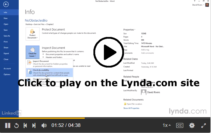
You can learn more about accessibility in Word by watching all of Chapter 2: Creating Accessible Word Documents on Lynda.com. In addition to the Lynda.com videos, you can find more information in the resources linked below:


Note: This video has closed captioning, so it does not need a transcript.


#FridayFact: Tables Can Be Boring

#FridayFact: Tables Can Be Boring published on

Old French Table by French Finds on Flickr, used under a CC-BY licenseThis week, I have been sharing information to help you polish the content and design of your Analysis project. Today, I am continuing that theme with my #FridayFact: Tables can be boring. If you do not work on document design, tables are often a visual jumble of words and numbers. Same goes for spreadsheets, but we won’t talk about them in this course.

Back to tables, with so much information jammed into columns and rows, the information can become hard to read. If it’s hard to differentiate between the rows of information, readers can easily lose track of where they are in a table. When the column headings scroll out of view, readers may not recall the information every column contains.

To help you solve the challenge of boring tables, I have these articles you can read and apply to your Analysis project:

There are a lot of ads on these pages. I use a browser extension that hides all the ads. I never see them at all. If the ads bother you, you might try one of the blockers too. I’m using Adblock in the Chrome browser.


Photo credit: Old French Table by French Finds on Flickr, used under a CC-BY license.


#InfographicInspiration: Choosing Colors

#InfographicInspiration: Choosing Colors published on

Using a Color Picker

Color Cop Icon
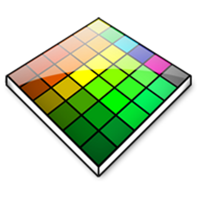
Often you see images on a website or photo that you like, but you may not know how to get the exact RGB or Hex codes to use them. You can use a color picker app to identify colors on your screen.

I use Color Cop on Windows and the Coolors Generator in my browser. You can find other options (free and paid) for Mac and Windows by googling for "color picker."

Today’s #InfographicInspiration focuses on colors. When working with tables, you can use shading and borders as part of your document design. Chosen well, colors can greatly improve a project, making the information more readable by creating contrast and highlighting important details. Chosen poorly however, colors can make a project harder to read because they lack contrast or distract from the information.

Think about how you use a highlighter in your notes or a printed book. If you highlight an entire page, essentially nothing is highlighted. Nothing can stand out. You have to have contrast between highlighted words and the rest of the page. Likewise, if your highlighter is drying out, it can leave very faint marks on the page. Again, there isn’t enough contrast between the elements on the page.

To make the most of your color choices, consider the ideas in today’s infographic. Any one of the ways of linking colors can make a nice contrast (e.g., choosing complementary or triadic colors). At the bottom of the infographic, you’ll find color palettes of combinations that work well. Do note that the infographic is British, so it uses British spelling.

How to Choose Colours That Work Well Together


Note: This infographic needs a text-based transcript. Because this image discusses colors, the transcript needs to identify and/or describe the colors. See the Optional Accessibility Transcript Activity for more details.


Extended Grace Period for This Week’s Labor Log

Extended Grace Period for This Week’s Labor Log published on

I have extended the grace period for the Labor Log due on Friday, September 29, by one day. The grace period now ends at 11:59PM on Tuesday, October 3.

Yom Kippur (the Day of Atonement) begins at sundown on Friday and lasts until nightfall on Saturday. I know that some of you may be traveling home to mark the holiday with family or participating in special events here in town. As a result, I wanted to give anyone who needs it extra time so that the assignment does not interfere with your religious holiday.

If you need more than one day, please email me to arrange what you need.


#WednesdayWrite: Can You Be Creative?

#WednesdayWrite: Can You Be Creative? published on

Lego Man Sugar Cookies by Betsy Weber on Flickr, used under a CC-BY 2.0 licenseOne of the limitations of sharing examples of a project written by a student with a class is that everyone then turns in nearly identical projects. Students take the examples as the only way to do the project, so they complete their work so that it looks precisely the same.

It’s like cookie cutter projects. The icing may be slightly different, but it’s obvious they are all part of the same batch. In fact, if you didn’t know better, you’d think they were plagiarized.

So today’s #WednesdayWrite is a challenge to you: Can you be creative? I hope so because your job this week is to brainstorm some ideas to get everyone thinking creatively.

Review the student examples from the assignment:

Once you have a good idea of the information and design used in the examples, spend some time thinking about the ways the examples are very similar.

Next, it’s time to get creative. Add a comment (or reply to a comment here) with idea(s) on what could be done differently with the Analysis project to make it stand out as different and more creative. To help you think about the possibilities, consider these questions:

  • Can you add details that are not part of the required information?
  • Is there a column you can add that is unique?
  • Can you think about the kinds of writing in a different way?
  • What can you do with document design that will make your work stand out?
  • Can you include something relevant in addition to your table of information?
  • What can you do to “think outside the box”?

I will point everyone in the class to this post next week, and encourage them to find some ways to make their projects different from those examples.


Photo credit: Lego Man Sugar Cookies by Betsy Weber on Flickr, used under a CC-BY 2.0 license


#TuesdayTutorial: Improving A Table’s Appearance

#TuesdayTutorial: Improving A Table’s Appearance published on

Lynda.com Login Help

Lynda.com videos are free to Virginia Tech students with your VT.EDU login. Start at the VT.EDU login page to access these resources.

Document design matters in every project you will compose in the workplace. If you think back to the CRAP infographic, you know that your choices can influence a reader to examine your document fully or to skip it altogether. Bad document design often leads folks to declare, “tl;dr” (or “too long; didn’t read”).

Most of the daily posts this week will suggest ways that you can improve your Analysis project by paying attention to the layout and formatting for your table. For our #TuesdayTutorial, I’m sharing some Lynda.com videos that demonstrate basic options for Formatting Table Appearance for Word 2016 and Word 365. If you have another version of Word, you should notice similar options in your version.

To learn even more about how to design your table, watch the entire chapter on Tables for either version or skip around and choose the sections you need:


Note: These video have transcripts, so they do not need transcripts.


Working on Your Analysis Project

Working on Your Analysis Project published on

This week, you will continue working on the Analysis of Writing in Your Field Assignment project. I have some activities that will help you find more information you can add to your project.

Readings for the Week

Photo of a worn Field Notes notebook with a black pen
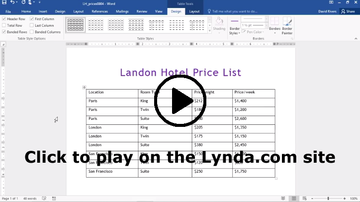
Check these resources for information about your specific field, and read whatever is helpful:

Tasks for the Week

  1. By 11:59PM on Monday, September 25, submit your 09/22 Labor Log in Canvas, if you are using the grace period.
  2. Ask any questions you have about the Analysis project in #general in SlackAsking a question is not required.
  3. Continue work on your Analysis project. Here are the relevant dates for the project:
    1. Wed, Oct 4 by 11:59PM: Post a draft of your project in the Group Feedback on Analysis of Writing Projects Discussion in Canvas.
    2. Fri, Oct 6 by 11:59PM: Post feedback on the drafts posted by your group members in the Group Feedback Discussion in Canvas.
    3. Mon, Oct 9 by 11:59PM: Submit your project in the Analysis assignment in Canvas.
    4. Thu, Oct 12 by 11:59PM: Submit your project in the Analysis assignment in Canvas, if you are using the grace period.
  4. Consider the general categories of communication that occur in your field. Read the information on the Poster: Writing and Communication – WOVEN from Georgia Tech, and then add your replies to the WOVEN in Your Field Discussion in Canvas
  5. Review the Readings for the Week for information that relates to your field. As you find relevant information add it to your Analysis table.
  6. By 11:59PM on Friday, September 29, write your 09/29 Labor Log in Canvas. Specific questions for your log are included in Canvas. The grace period for your log entry ends at 11:59 PM on Monday, October 2.


Photo credit: Evernote ETC: My Field Notes by Brooks Duncan on Flickr, used under a CC-BY 2.0 license.


#WeekendWatch: Using Strong Verbs

#WeekendWatch: Using Strong Verbs published on

This week’s #WeekendWatch focuses on revision strategies that will strengthen your writing. Strong verbs can improve everything that you write. They are particularly helpful in your job application documents, since those strong verbs show off your capabilities.

I’m sharing this video today because you can apply these ideas to your Analysis project. In some of the columns of your table, you will most likely use fragments. Here’s an example for the kinds of writing I do:

Kind of Writing Description
Syllabus
  • Explains course goals and requirements.
  • Outlines the policies for the course.

The verbs in the Description column strengthen the document. Just as a reminder: Your tables should include more information than just description.

Find out more about how to revise for strong verbs by watching the video (2m10s).


Note: This video has closed captioning, so it does not need a transcript.


#FridayFact: Good Writing Means More Money

#FridayFact: Good Writing Means More Money published on

Today’s #FridayFact explains the impact that good writing skills can have on your salary. Obviously, the situation will vary from job to job and company to company, but overall, if you are a good writer, you have a good chance to earn more than someone who doesn’t write well.

People with Stronger Writing Skills Are Better at Their


Note: This infographic needs a text-based transcript. See the Optional Accessibility Transcript Activity for more details.


#InfographicIdeas: Intercultural and Global Awareness in the Workplace

#InfographicIdeas: Intercultural and Global Awareness in the Workplace published on

Today’s infographic focuses on Business Etiquette Around the World. The image outlines how people introduce themselves in the workplace, how business meetings work, and how people interact when dining with coworkers or (potential) clients.

You can include information about intercultural and global influences on the different kinds of writing that you include in your Analysis Table, so today’s infographic should help you begin thinking about how writing and communication may change depending upon where your audience lives or what they cultural background is.

I’m not convinced that everything in the infographic is 100% accurate. For instance, it seems like a stereotype to think that everyone has to do a solo karaoke performance after dinner in South Korea. Does anyone know?

As you look at the infographic, you can respond to what you see here, following any of these ideas (or an idea of your own):

  • Can you provide details that confirm or challenge claims in the infographic?
  • Can you add information for a country—either something that is missing or a country that isn’t listed?
  • Is there anything that surprises you? anything that you might need help adapting to?
  • Can you share an experience where you did (or didn’t) follow intercultural expectations?
  • Can you tell us more about any of the practices listed here (such as the significance of a practice or why things are done in a particular way in a culture)?

Infographic on Business Etiquette Around the World


Note: This infographic needs a text-based transcript. See the Optional Accessibility Transcript Activity for more details.


Primary Sidebar