 Last week, I shared design tips that you can use to improve your Analysis table. This week, I am going to share several posts that address proofreading and formatting changes that will make your project even better.
Reading Patterns and Centered Text
Today’s #TuesdayTutorial focuses on the alignment of the text in your document. Remember the #FridayFact in September that explained the F-shaped reading pattern? That idea comes into play with the tip to avoid centered text alignment in your documents.
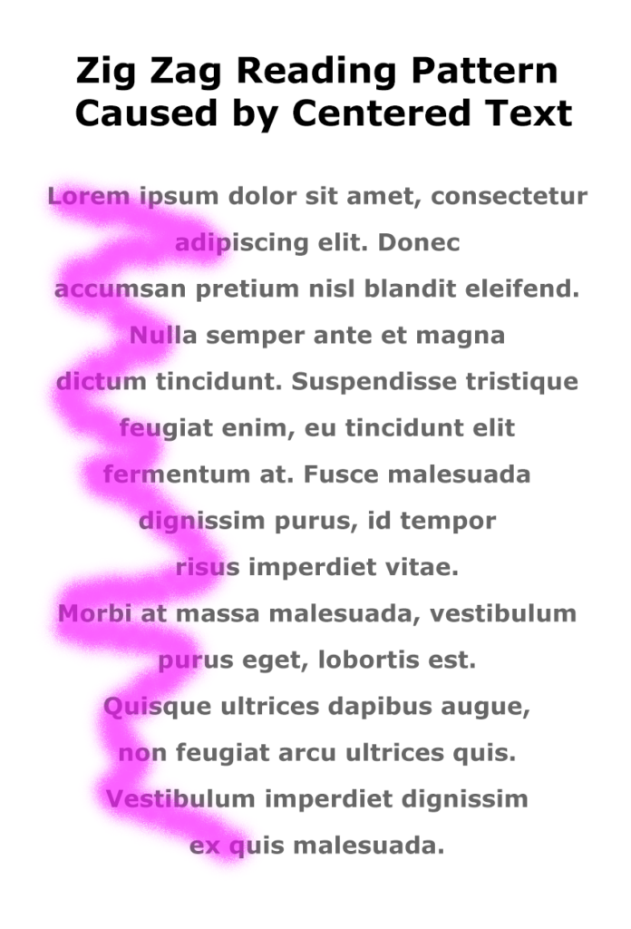
When you center text, the left margin zig zags back and forth down the page, which makes it hard to read in the F-shaped pattern that people prefer.
Instead of skimming down the left margin to look for the highlights and headings, the eye has to search back and forth for the information on the page, as shown in the image on the right.
Learn More
Watch the following Lynda.com tutorial video, Favor flush-left, ragged-right body text (4m14s), for additional explanations and tips on this important guideline for the way that text is aligned on a page. Remember that Lynda.com videos are free to Virginia Tech students with your VT.EDU login. Start at the VT.EDU login page to access these resources.
Note: This video has closed captioning, so it does not need a transcript.
