Skip to content

#InfographicIdeas: Intercultural and Global Awareness in the Workplace

#InfographicIdeas: Intercultural and Global Awareness in the Workplace published on

Today’s infographic focuses on Business Etiquette Around the World. The image outlines how people introduce themselves in the workplace, how business meetings work, and how people interact when dining with coworkers or (potential) clients.

You can include information about intercultural and global influences on the different kinds of writing that you include in your Analysis Table, so today’s infographic should help you begin thinking about how writing and communication may change depending upon where your audience lives or what they cultural background is.

I’m not convinced that everything in the infographic is 100% accurate. For instance, it seems like a stereotype to think that everyone has to do a solo karaoke performance after dinner in South Korea. Does anyone know?

As you look at the infographic, you can respond to what you see here, following any of these ideas (or an idea of your own):

  • Can you provide details that confirm or challenge claims in the infographic?
  • Can you add information for a country—either something that is missing or a country that isn’t listed?
  • Is there anything that surprises you? anything that you might need help adapting to?
  • Can you share an experience where you did (or didn’t) follow intercultural expectations?
  • Can you tell us more about any of the practices listed here (such as the significance of a practice or why things are done in a particular way in a culture)?

Infographic on Business Etiquette Around the World


Note: This infographic needs a text-based transcript. See the Optional Accessibility Transcript Activity for more details.
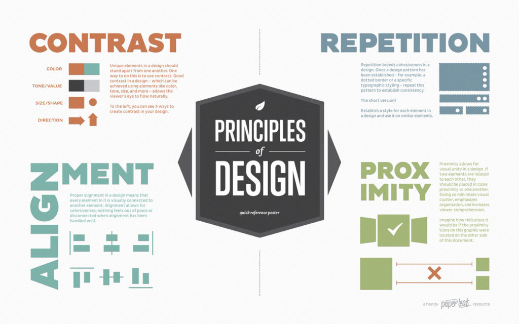


#InfographicInspiration: Put CRAP in Your Document Design

#InfographicInspiration: Put CRAP in Your Document Design published on

Lynda.com Login Help

Lynda.com videos are free to Virginia Tech students with your VT.EDU login. Start at the VT.EDU login page to access these resources.

One of my favorite ways to talk about strong document design is the CRAP method. CRAP stands for Contrast, Repetition, Alignment, and Proximity. Using all four of these elements helps give your work a polished appearance and catches readers’ attention.

This week’s #InfographicInspiration gives you a quick overview of all four elements. It is worth saving for future use, and try applying it to your professional biography assignment before you turn it in on Monday.

For a more detailed explanation of the CRAP elements, watch the Lynda.com video, Understanding the PARC system (Lynda.com was apparently afraid to say CRAP, so they spell it backwards).


#InfographicInspiration: Which Team Are You In?

#InfographicInspiration: Which Team Are You In? published on

Reminder of how today’s posts work
#InfographicInspiration posts present an infographic about communication and writing in the workplace.
 

The Infographic

Today’s infographic is a fun look at teams and teamwork. It is long and detailed, so you need to click the image to see the full size version.

Once you read through the analysis of teams the image presents, think about teams you have been a member of (including your writing group in this course). You can make a comment below that answers one of the questions below, or write something else that you noticed or thought of.

  • Does the team you are thinking of match any of those in the infographic? Tell us how.
  • Are there any teams you would add to the infographic? If so, consider creating a small image that presents your dream team, modeled on the infographic.
  • How do the characteristics of teams in the infographic relate to those in the readings for this week?


Note: This infographic needs a text-based transcript. See the Optional Accessibility Transcript Activity for more details.


Primary Sidebar